Tips for Creating Email Newsletters
Email newsletters are a unique communication medium. Though they serve up rich HTML content like web pages do, different rules apply to them, since they will ultimately be viewed from within email applications and not in web browsers. Thus, there are some things to keep in mind while creating a newsletter as opposed to other web content.
Here are some tips for keeping your newsletters looking great across multiple email apps.
Paragraphs and Headings
Paragraphs and headings may not display consistently across all email applications as they might on the web. For example, both Google's Gmail and Android email applications will ignore your site's default font styles (set in the main CSS stylesheet of your website), making the text display in black.
Inline styling
Even if you have only a little experience with HTML and CSS, you can quickly add inline styling to your text to produce custom styling across all email applications (inconsistent styling is more of an issue with headings). Open the HTML view of your newsletter content and follow this example to add an inline style:
Original:
<h2>Upcoming Events</h2>
With inline style:
<h2 style="color:red !important;">Upcoming Events</h2>
You can also add the !important rule to inline styles (as seen above) in case some email apps still seem to override your styling, i.e., like when Hotmail turns your headings green.
Note: Inline styling is only recommended for newsletter content; it is not recommended for page content.
Images
Image sizes
If an image you wish to use wasn't specifically sized for your newsletter template as specified by your designer, you may simply adjust the image size via the CMS. Select the image and click on the "Insert/edit image" button and specify the width and height of the image to avoid image size problems in your email. If an image is too wide for a particular column in your newsletter, the column will likely expand with it.
Image border
Set a border of "0" on your linked images to avoid an unnecessary border around images your email.

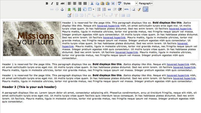
Text wrapping images
When using the align tools in the content editor, the image moves to either side and allows text wrapping for the following paragraphs. Some email clients unfortunately do not support this feature as would web pages. So, to position an image beside of a block of text in newsletters, it's best to create a simple table of two columns and insert the image in one side and the text in the other, like this.
Other tips
Do
- Test your newsletter in multiple email applications.
Which are most popular? See below for email client market share percentages.
- Test your newsletter again.
Really! Even if you only made a minor change, test your newsletter again to be sure of its appearance before you send.
- Let users know why they're receiving the email.
A subscriber may have signed up by accident, or forgotten why they signed up. Explain in the newsletter how one would have signed up for the newsletter, and that an unsubscribe link is available when necessary.
- Use "absolute paths" for images (including your domain "http://www.site.com/" in the source URL).
The CMS already takes care of this for you for images inserted via the WYSIWYG content editor. Make note of this tip when pasting in your code from another application.
- Offer links to let users 1) unsubscribe and 2) view the message as a webpage.
The CMS provides these links automatically. If you'd like to move them or change their appearance, contact your web designer.
Avoid
- Creating your newsletter content as one large image.
Not only may spam filters catch the message, but some email apps by default will not display images.
- Using embed codes (videos, forms, etc) in your newsletter.
Embed codes containing scripts are not allowed in newsletters. It's best to provide a link for the user to view this kind of content on a webpage instead.
- Using overly complicated CSS styling.
Using CSS for layout (positioning your elements) will produce inconsistent results within email apps. Tables are the current standard for email layout.
Further reading
For a breakdown of email client market share, see:
http://litmus.com/resources/email-client-stats
For a comprehensive list of accepted CSS styling rules in various email applications, see:
http://www.campaignmonitor.com/css/